Scrolling through your social media feed, you find yourself stopping on that post with big bold type and tasty graphics. It got your attention quickly, right?
The fact that design influences our daily lives and how we make choices is no secret according to Susan Weinschenk’s book “Neuro Web Design: What Makes Them Click?" Colors, fonts, and images speak to us on a subconscious level. They have been baked into our brains and influence how we perceive brands and inform the choices we make.
(I suggest checking out Weinschenk’s book if you want to learn more about how your brain works and the research on motivation, decision-making, and neuroscience relevant to website design.)
The best brand experiences are framed in a “story” that connects with their audiences on an emotional level. These stories can be structured using concepts that are familiar and recognizable to the audience because of common cultural experiences and traditions.
This makes the material more easily understood and the audience can instantly identify their “problem” and how our “solution” can work for them. Most importantly, it connects with our audience in a more personal way, building trust in the brand, and customer loyalty.
Writer and cultural anthropologist Mary Catherine Bateson said, “The human species thinks in metaphors and learns through stories.”
A metaphor is a figurative comparison in which one idea is understood in terms of another. This is where the common experiences and cultural traditions become important!
Metaphors, as a mode of communication, tell the story in a more succinct and direct way than words can do in the same amount of space. Hence, a picture is worth a thousand words!
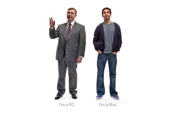
Apple used a metaphor to compare Mac with PC computers using easily recognizable personality stereotypes. The hugely successful ad campaign captured the essence of the message that Macs are more casual and cool, even friendly and helpful.
We understand implicitly why we would connect with a Mac better than a PC. This particularly successful application of metaphor was understood across cultural boundaries and at least 24 content pieces were dubbed into Spanish, French, German, and Italian.
Beyond personal experience within our current time frame, we can build on visual cues from our recent past and history, such as the school of Bauhaus, the Psychedelic movement, and the entertainment industry.
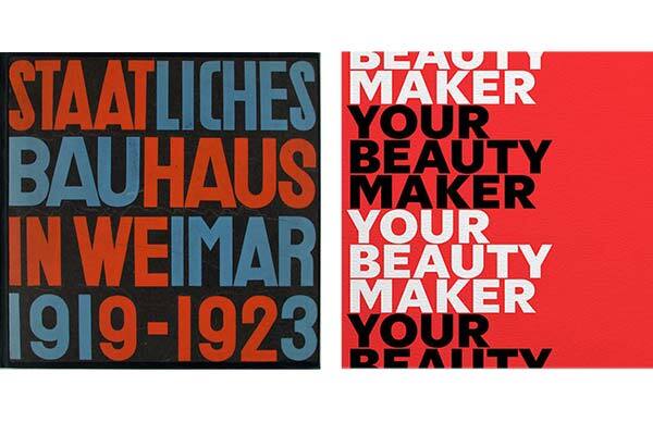
The Bauhaus was the school of arts and design movement that gave us the phrase, ''form follows function.'' They were, in fact, the first school to introduce graphic design and stress the importance of purpose-driven design as much as fine arts.
Known much more for their impact on architecture, they also contributed to the field of typography designing simple font forms that supported the ideals of functionality and accessibility. These bold styles communicate clearly and focus our attention.
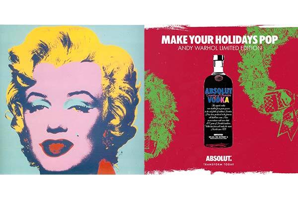
The Psychedelic movement from 1960-1975 was about youth in America “addressing many controversial issues—from civil rights, the Vietnam War, nuclear proliferation, and the environment to drug use, sexual freedom, and nonconformity.” Pop culture was invented here, and modern design trends still vibrate from the color and type pairings and optical art patterns that Andy Warhol and others helped pioneer. Color plays the part of conveying a sense of fun, used as a decoration and to accentuate the image.
The 1980s gave rise to materialism, big hair, and Reaganomics. Genres like horror and the supernatural were prominently represented in movies and literature.
Print Magazine documents how 1980s retro has taken over typography and graphic design as of late.
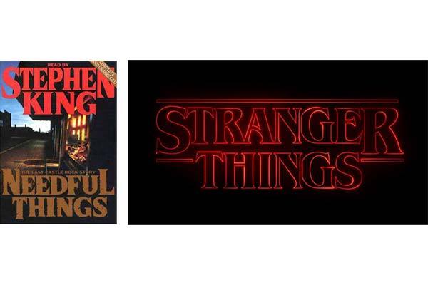
Nostalgia for the 1980s is alive and well today—which is demonstrated by the Stranger Things logo seen on Netflix. You can clearly see how the logo was developed, spring boarding from style developed for Stephen King’s classic novels first made popular in the 1980s.
When drawing upon nostalgia, marketers must keep in mind who their target audience is and avoid falling victim to the “focus-group-of-one” syndrome when using storytelling and leveraging common cultural experiences. If you get it right, the payoff can be big in this era of social media. Get it wrong… cue Pac-Man death sound effect.
Of course, this really only scratches the surface of our vast body of influencers both past and present, how we craft meaning into message, and how our brain processes these cues.
I’d love to hear from you about your favorite designer, brand, or product and what you think about their approach to telling their story and if you think it was a bonus or a bomb! Email me your thoughts!


