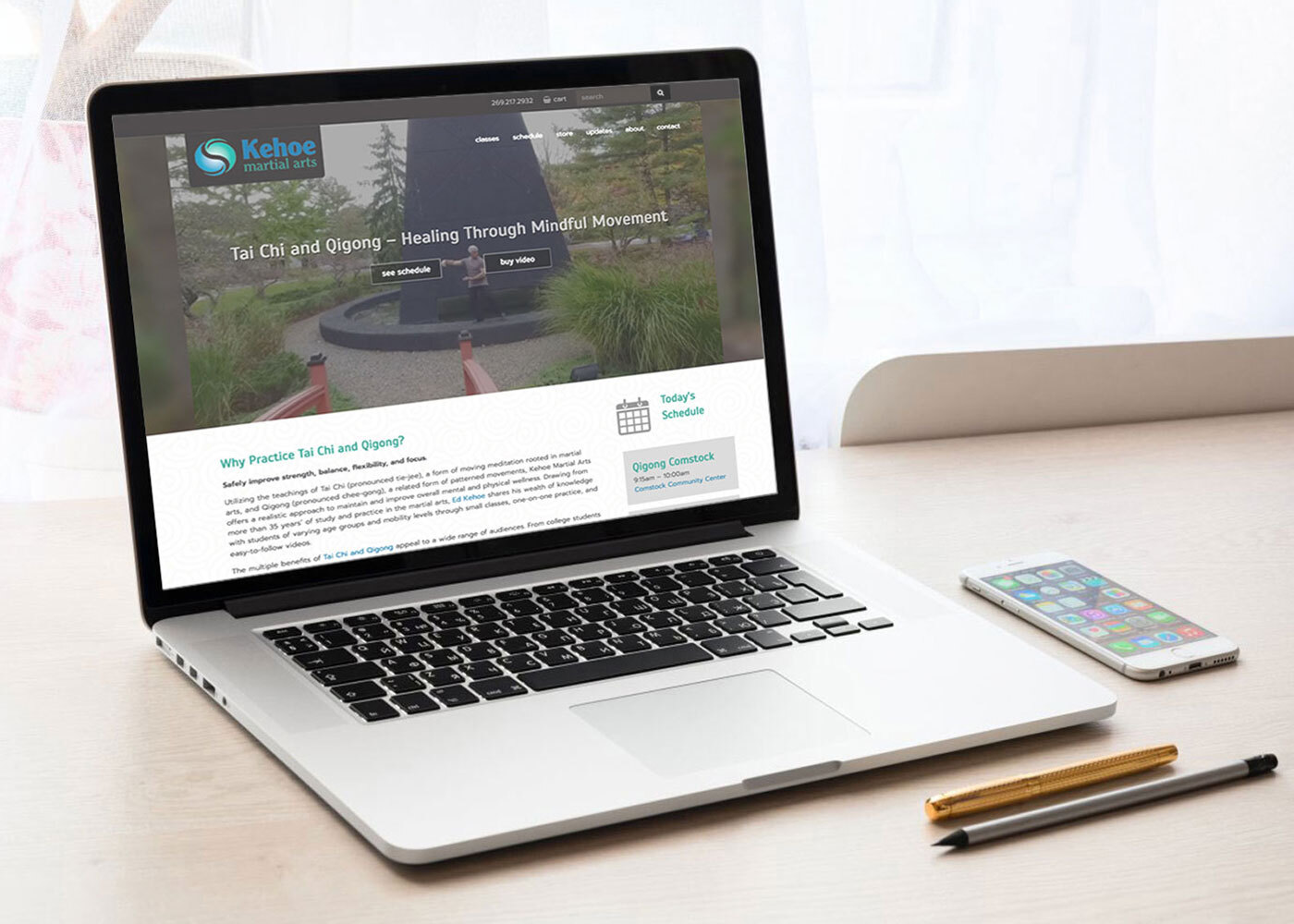
LKF incorporated the essence of Kehoe Martial Arts in an updated logo.
What started as a side business for Ed Kehoe grew into a full-time operation known as Kehoe Martial Arts. As the sole instructor, Kehoe turned to LKF Marketing for help reinventing his company's identity and prepare for future business growth.
The new logo for Kehoe Martial Arts had to be simple, yet illustrative while encompassing the depth of Ed Kehoe's martial arts knowledge and teaching. As a student and teacher of Tai Chi and Qigong for more than 25 years, Ed stressed the use of fluid movement and the ability to regain strength and inner balance through mindful practice. The revised logo mimics a yin yang in shape and incorporates water droplet-like elements to represent the movements Ed and his students perform.
Services Provided
Account service, competitive analysis, graphic design


