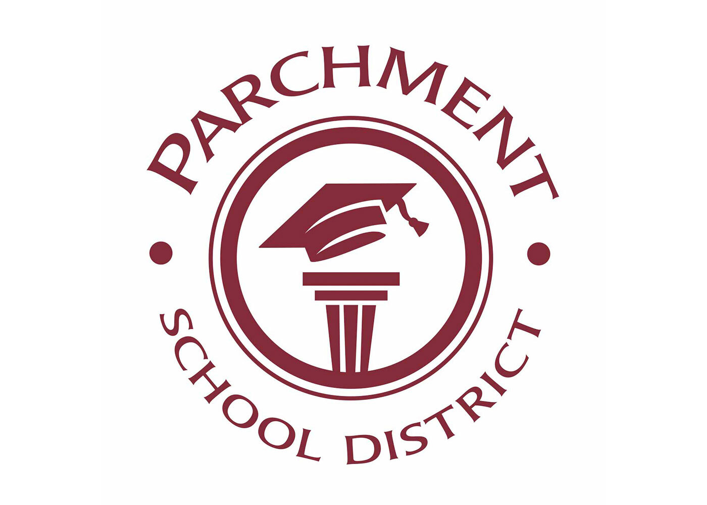
LKF rebranded the district's official seal for use on letterhead to logo wear.
As we worked to brand Parchment as a destination district with a quality education in Kalamazoo county, it was clear that the district logo needed an update. The old logo featured dated fonts with an image of a person reading. We felt the logo could be mistaken for a library logo easily.
The challenge was to come up with a logo that focused on quality of education but remaining true to Parchment's personality. The resulting graphical logo features a modernized version of the three pillars of education graphic, with a graduation cap on top of the pillars. This symbolizes Parchment's mission to help students succeed by educating them for their brightest future. The district's maroon color was used to tie in with other branding efforts and a style guide was established to manage the brand going forward.
Services Provided
Account service, competitive analysis, graphic design


