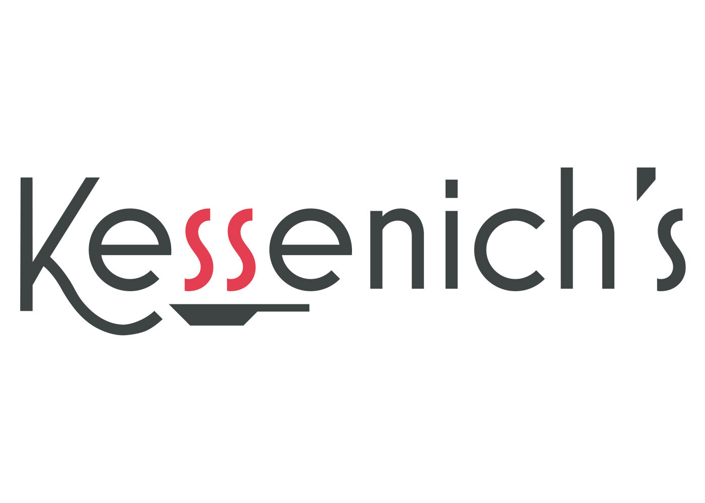
A new logo was designed by LKF to assist with refreshing Kessenich’s brand.
In early 2018, Kessenich’s, a subsidiary of Great Lakes Hotel Supply, connected with LKF to assist in expanding their marketing efforts and increasing brand recognition. To begin this process, LKF suggested a redesign of the client’s logo.
As Kessenich’s is a company that specializes in commercial foodservice and bar equipment and supplies, LKF knew that their new logo had to make a clear connection to the industry that it serves. Additionally, the logo had to communicate that Kessenich’s had been providing quality service for 90 years.
The new logo made use of black text that was stylized but readable. To make the connection to foodservice, LKF chose to color the two “S’s” red with a frying pan underneath them. Visually, this makes the two letters look like heatwaves rising from the pan.
In the end, the new logo helped generate awareness for Kessenich’s as the marquee choice for commercial and kitchen design in and around Madison, Wisc. and has been used in pieces ranging from the smallest collateral materials to the organization’s website.
Kessenich's logo received a Silver Davey Award from the Academy of Interactive and Visual Arts in 2019.
Services Provided
Account service, competitive analysis, graphic design, vendor management
